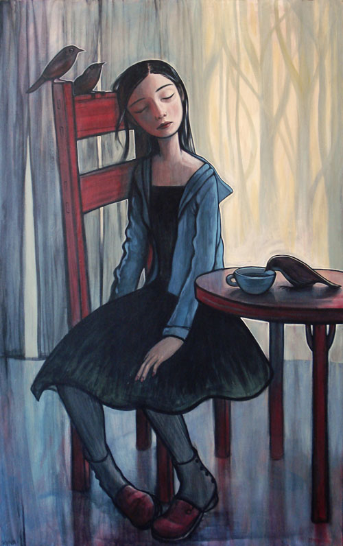
by Kelly Vivanco.
Category: Art
Dem bones
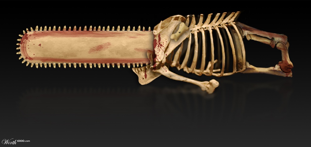
There are lots of neat images over at Photoshop Phun website Worth1000, but you rarely see images so good they could be called great art. Shown above is the wonderful work Authentic “Mammouth Killer” Chainsaw by user tysambouille.
Musicians unspooled
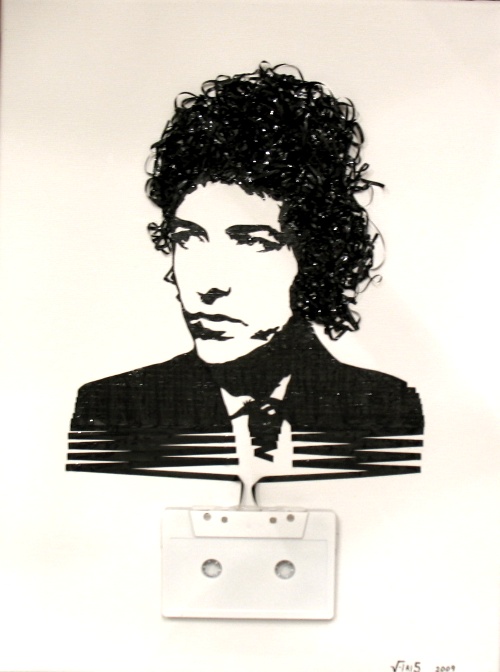
I’m a sucker for artists who have managed to turn black and white creations into fully colorful creations. Kara Walker can do it, and so can Erika Iris Simmons. Her series of cassette tape art creations, Ghost in the Machine, portrays artists in the medium that many of us first heard them on.
Oh my kiss breath turpentine
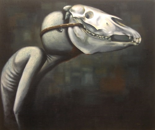
Some images make you wonder “What the hell?!” Then you shrug your shoulders and move on. Others generate the same first reaction, but then you keep coming back for another look. The simple, strikingly beautify “Monster” by Paul Flinders is one of the stickiest paintings I’ve ever seen. It absolutely demands that you make sense of it before moving on. This could take a while…
See extended for a detail shot.
(more…)
Vampire
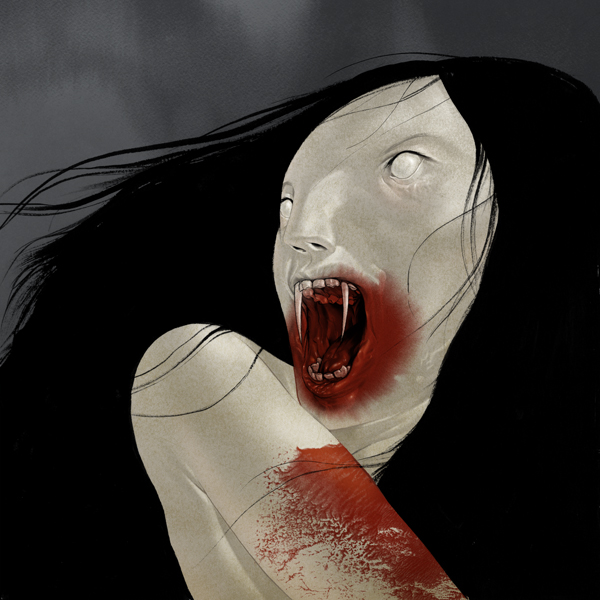
by illustrator Sam Weber.
How to make a white cinder-block wall look worse

I hesitate to even upload this crap to my site, but eventually the buzz about some artist rings so loud in my ears I have to do something. The above mural is typical of Can Two, who are doubly dammed for working in a medium that, to date, has produced exactly one artist worth more than ten seconds of your time, and for making his work “kid friendly”. Stylized, aribrushed, illegible text, uninspired color choices, urban hip-hop caricatures, sloppy composition. Instead of Bombing the Suburbs, how about we tar and feather the graffiti artists?
Dr. Seuss Demento
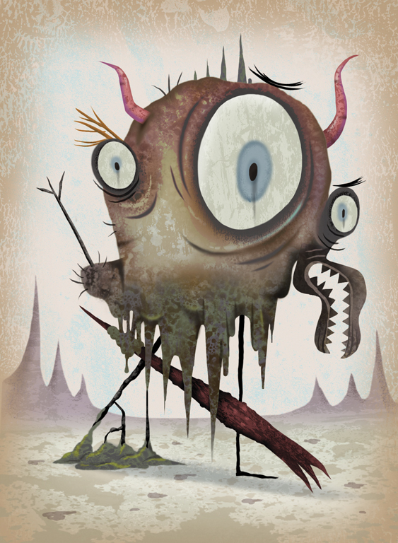
Michael Slack advertises himself as “Art for Kids and Juvenile Adults”. Think Salvador Dalí meets Dr. Seuss in a dark alley, and after Seuss beats up Dalí (Theodor could be a mean bastard with a wicked uppercut, bet you didn’t know) they decide to go watch Ren and Stimpy for inspiration.
Art for posters sake
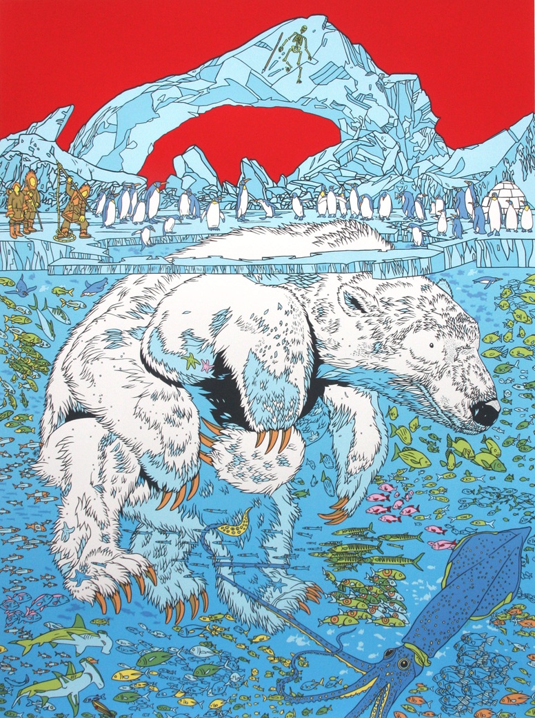
“Kukweaq 2” by Tyler Stout.
When I was in my mid-teens I visited Paris with my family. I remember only two things clearly from our short trip. One: The Parisians were ruthlessly unforgiving with my mediocre third-year high school French. And two: There was this giant old metal building with an enormous open space inside, with a relatively narrow walk that went all the way around up top, looking down over a huge unused expanse below. The upper level had a poster exhibit. Like many kids with a limited budget and artistic pretensions, I had lots of posters on the walls of my room. The usual suspects: Dalí, Escher, Magritte. None of the exotic works, just the regular ones you can still find at a typical middle-American mall with upscale pretensions. Friendly posterized art by the great illustrators.
The small exhibit of poster art in that giant Parisian enorma-dome absolutely blew my mind. There were rock-concert posters of course, but also Eastern-European propaganda, advertisements in languages I couldn’t place, exotic color mixes, unusual line strokes, bizarre typography, and extreme images, unlike anything I’d seen before. Great poster artists are also great craftsmen, carefully constructing their illustrations within fixed limitations and color pallet to make us smile, laugh, think, or act. I could have spent two days up there, staring slack-jawed with wonder.
Sacred heart of Mario
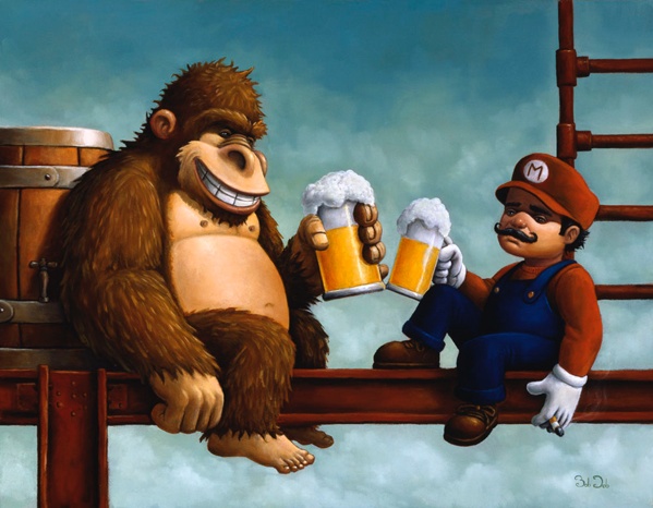
For centuries, the art world was dominated by religious icons. If you painted, and you wanted to get paid for it, your subject matter was strictly Old or New Testament. The Church was your biggest patron, and the subject matter was something everyone around you understood.
See extended for more… (more…)
Color explosion
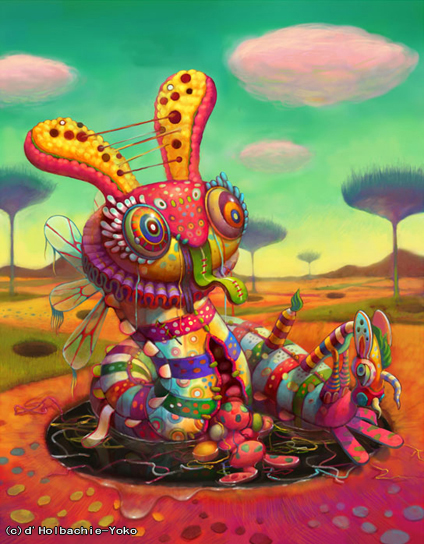
The paintings of Yoko d’Holbachie are so extraordinarily colorful they are almost hard to look at. Looking at many in a short period of time is like going on an all-Squishee bender. Though terrifying, I recommend it highly.
