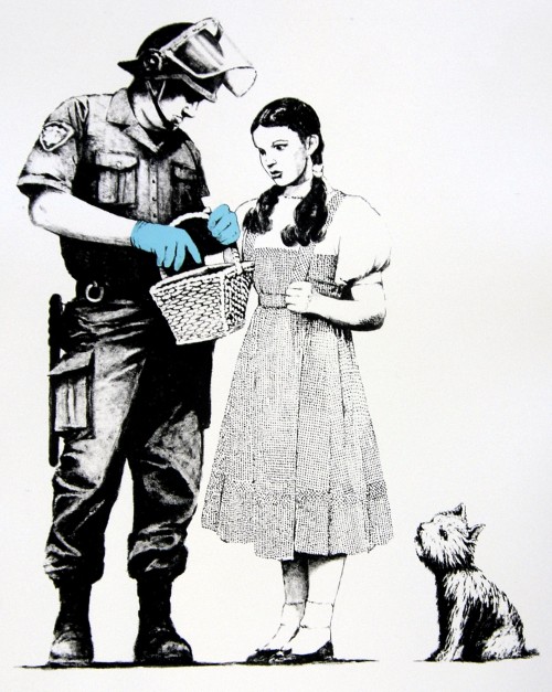
By and large political street art, or street art with a message, is crap. The very best players create beautiful propaganda, while most of the others are cheap-shot artists, whiney ideologues or humorless vandals who produce works completely devoid of subtlety or introspection. Banksy, whose work “Stop and Search” is pictured above, works at a level so far above the others there’s really no comparison.
Tag: Banksy
Credit where credit due

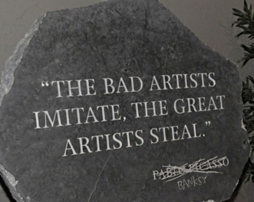
Famous quote by Pablo Picasso Banksy.
How to make a white cinder-block wall look worse

I hesitate to even upload this crap to my site, but eventually the buzz about some artist rings so loud in my ears I have to do something. The above mural is typical of Can Two, who are doubly dammed for working in a medium that, to date, has produced exactly one artist worth more than ten seconds of your time, and for making his work “kid friendly”. Stylized, aribrushed, illegible text, uninspired color choices, urban hip-hop caricatures, sloppy composition. Instead of Bombing the Suburbs, how about we tar and feather the graffiti artists?
