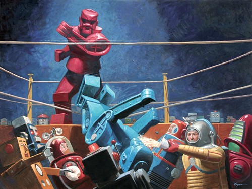
I think that for all of us, of a certain age, the world of robots is both fun and a little scary. They are toys, factory workers, drones, and self-conscious science fiction icons hell-bent on eliminating us before we unplug them. Eric Joyner brings the world of old-time sci-fi robots to life with his collection Robots & Donuts. Above is What We Ought Not, We Do, a classic boxing knock-out scene re-envisioned with kid’s robots.
Category: Art
Looking for a different space
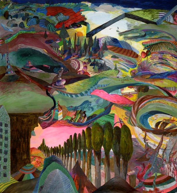
Jamie Nelson creates multi-layered landscapes with multiple, curving perspectives and disorienting points of focus. Colors are rich, detils carefully constructed to give away just enough to frustrate. Geometric shapes suggest but don’t fully commit to know objects.
Zombie #3
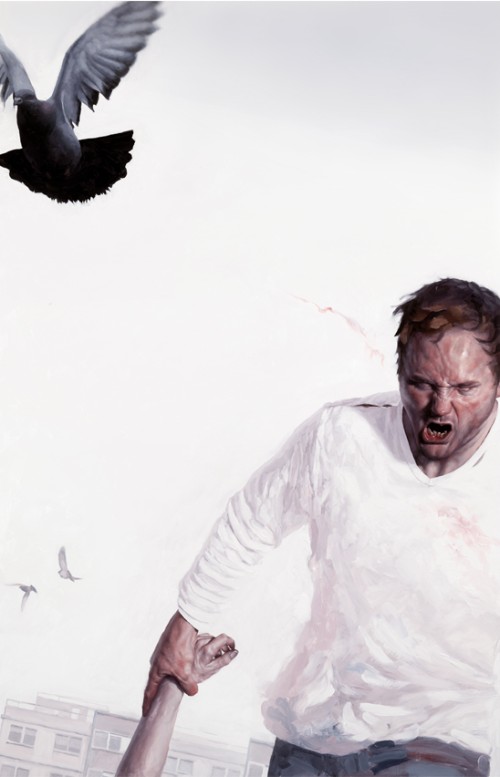
By Jeremy Geddes.
Baby you’re a wrecking ball, crashing into me
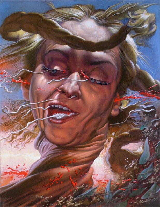
In Italian artist Nicola Verlato’s paintings, bodies contort with the drama of the scene, often naked, and moving in space. Everything is drama, and obvious symbols (the oil dereck, the Disney character) are used in obvious ways along with cheap attempts to shock or appall with gore and violence.
False Revolutionary
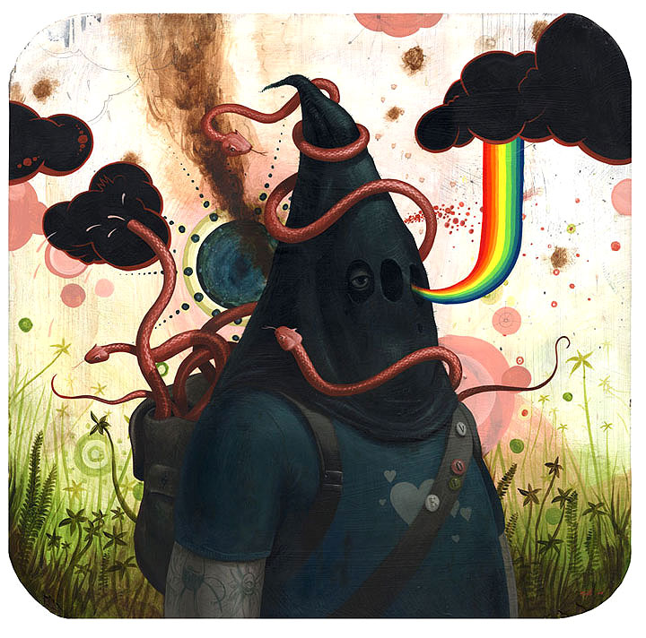
by Jeff Soto.
Leather on the outside but a delicate interior
When exaggerating for comedic effect, it’s important to find just the right level of exaggeration. Our brains automatically filter out information that is too far removed from the credible, with ruins the effect. You have to get the listener to actually consider the plausibility of what you are saying for just a moment, and not just immediately dismiss it. In his review of the new Transformers movie, “Revenge of the Fallen”, Charlie Jane Anders writes:
The closest thing I can think of to this movie is the Wachowskis’ “Speed Racer”, which had a similar kind of CG image overload, although it was only five hours long as opposed to ROTF’s nine.
If Anders had used 500 and 900 hours, instead of 5 and 9, there would be no joke.
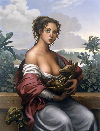
With art, you can cut even closer to the edge of plausibility, and the effect goes from comedic to disturbing to funny to sublime.
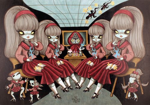
Shown above is “Martinique”, by artist Cristina Vergano.
Clean, strain, brush and wack
The worst thing an artist can do

“Well executed and tightly rendered artwork, by skilled and competent artists, has been considered intellectually insignificant by the international fine arts community for more than fifty years… for over half a century, art connoisseurs have allowed themselves to become too self-engrossed with their relative presence in front of art to actually see the art itself, something along the conceptualist philosohy of ‘I declare this pile of sand to be brilliant, therefore I am briliant in my predication.’
…
The worst thing an artist can do, when working within the conventional art world, is to load-up a piece of artwork with too much forethought and detail. Preoccupied art admirers can’t digest creative expression that requires their exhaustive investigation.”
–Robert Williams, writing in issue #56 of Juxtapoz magazine.
Shown above: In the Pavilion of the Red Clown.
Monster mashup
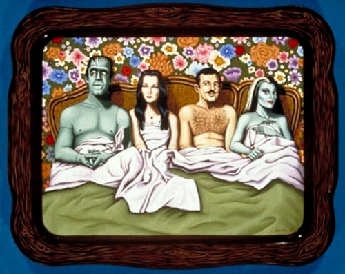
Artist Isabel Samaras paints familiar pop-culture TV icons into new, often sexual, often quite explicit, situations. Though quite talented and imaginative, Samaras’ creations are ultimately as hollow as The Munsters themselves, knock-offs played for canned laugther or gawking, mildly titilating until you are too bored or embarrased to keep looking. Above is “Herman and Morticia and Gomez and Lily”.
