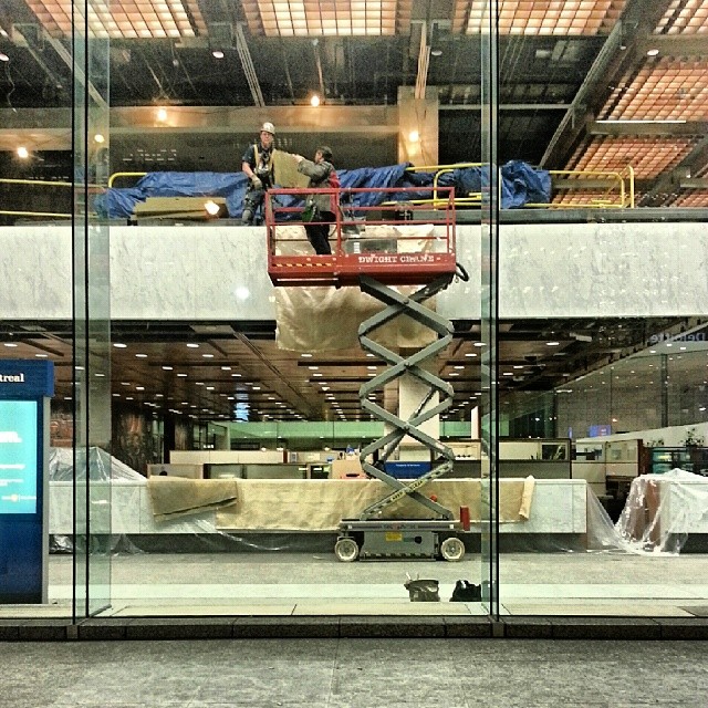
Hi there! After hours work at BMO.
Category: Architecture
Hold up
Totem
Tie Dye
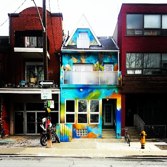
Back in the market this afternoon for lunch.
AGO Good Room
All mediums of creative expression follow the same kind of cycles, broadly speaking. Pioneers explore some aspect of the medium, laying down the initial rules and setting the early templates. This is followed by a round of improvements and tweaks, where rules are adjusted and extended. Competition drives up quality, richness and complexity explode. Talented individuals and groups dominate their medium and begin to explore it’s edges, pushing boundaries and challenging audiences. Before long, burn out and fatigue sets in, especially among the creators. The conversation turns inward, as do the jokes and references. Complexity reaches a breaking point, where appreciating the latest artistic expressions requires years of study.
Sometimes the medium ossifies (as in The Opera). Other times the creators — now bored, restless, worn out or lazy — blow up the medium, overthrowing old rules and patterns. Quality gives way to novelty, constructing rich artworks is replaced with a rush to deconstruct previous assumptions. Counter-reactionary elements try to hold the core, but their efforts, however popular, seem trite, insipid, the application of talent to cynical exploitations of nostalgia (see Kinkade, or trace the whole story from early Beatles to late Beatles to Yoko Ono to Wings).
Eventually, a new round of innovation begins, sometimes in the guise of a return to past ideas of quality, now updated to include the latest technologies and techniques. Other times innovation emerges as meticulous attention to detail fuses with unlimited imagination, accepted patterns expand to subsume populist elements in ironic or post-ironic fashion (see Mark Ryden and the Lowbrow art movement or an old article I wrote about post-irony).
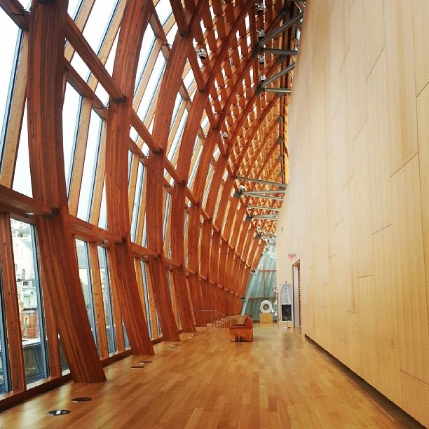
Architecture, especially big expensive public architecture, has the least room to hide, and is the most susceptible to rot as familiarity and iconic status elevate dreck and schlock into warm fuzzy feelings through the magic of nostalgia (as in the CN Tower, or local “landmark” Honest Ed’s). This drives architects to experiment with novel forms on the assumption that distinctive designs will come to be accepted over time, independent of quality and foresight (see my post about the Royal Ontario Museum). Other times, these forms become instant classics, fusing great design with extraordinary presence, redefining the rules at a higher level of innovation, as is the case with Ai Weiwei’s “Bird’s Nest” stadium, or Frank Gehry’s masterful addition to the Art Gallery of Ontario, show in the photo above.
Where nothing ever happens
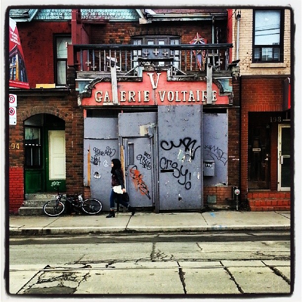
Galerie Voltaire on Bathurst.
ROM so bad
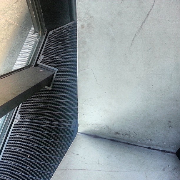
This is a detail of the Royal Ontario Museum’s exterior wall, as seen from the inside. This part of the museum, called The Crystal, was completed just six years ago. If this little slice of dirt and decay were an aberration, I wouldn’t bother highlighting it. But everywhere you look, the same lack of foresight and quality is visible. Walls look unfinished. Space is carved up into awkwardly shaped, unusable chunks, including a couple large areas right near the main lobby. Most famously, the exterior surface had to be reworked extensively because the architect failed to anticipate the implications building a huge sloped exterior in a city that gets nearly four feet of snow per winter.
Empty
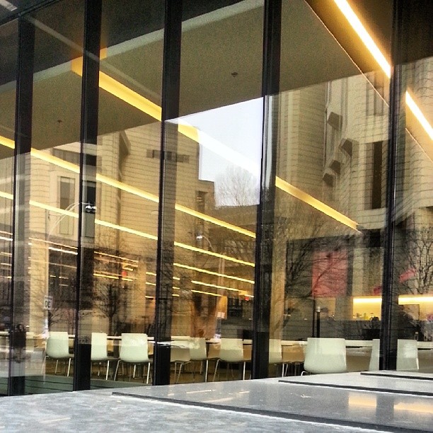
Robarts library reflected in the windows of the new Rotman building on the University of Toronto campus.
Lower Bathurst
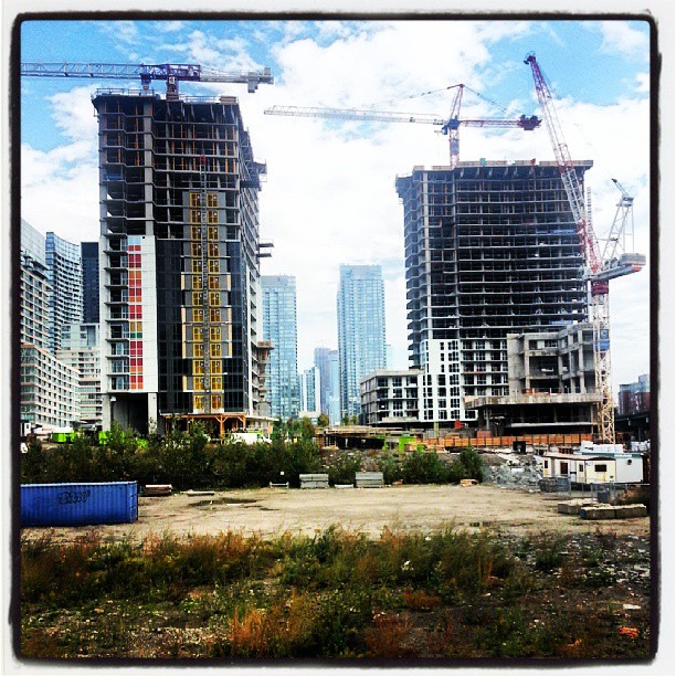
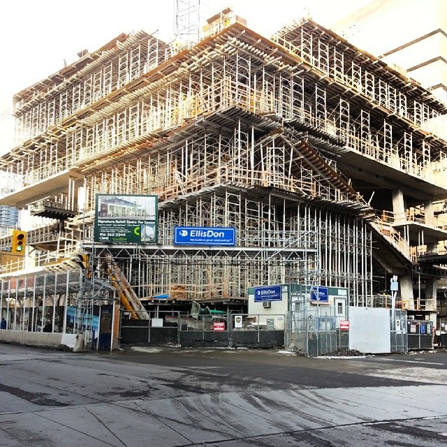
Construction near lower Bathurst.
Moonbean
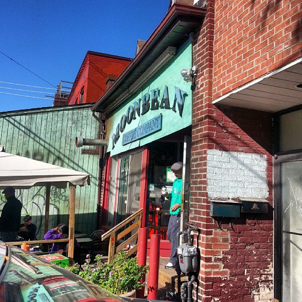
Morning at the Moonbean cafe in Kensington.
